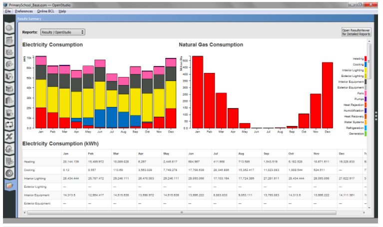
Openstudio's Electrical Consumption, Heating and Cooling Graphs, Monthly Values
Hello, I was wondering if anyone would know how to generate the charts that follow in the Openstudio's results as shown below:

I have been able to generate some data however it only comes in the form of discrete values such as site and source energy (generated as energy plus Results) as opposed to showing the monthly fluctuating electrical consumption and so forth. Additionally is it possible to generate monthly graphs such as these outlining the heating and cooling loads experienced?
Any help would be greatly appreciated.


You can report the output variables of interest and view them through the data viewer (DView) which displays time series results in graphical format. In your case you can click on the Results Viewer (top right corner in the image you attached) and view detailed results. For something as simple as generating monthly bar charts, why don't you just copy the data of interest to excel and generate your own figures/charts?
Ah I understand what you are saying thank you. Yes it would be possible to import the data into excel I was just hoping to understand why the software fails to graphically interpret the data. In the reports drop down bar on the top left it only has the option of "EnergyPlus Results" I was hoping to possibly view the "OpenStudios Results" but am unable to understand how I can generate them.
In the top right corner as you described it states on my computer "Set Path to DView in Preferences" have you come across this or perhaps know how to fix this? Any further help would be appreciated.