
I've searched a bit on the forum (keyword "Data Viewer" and not found anything.
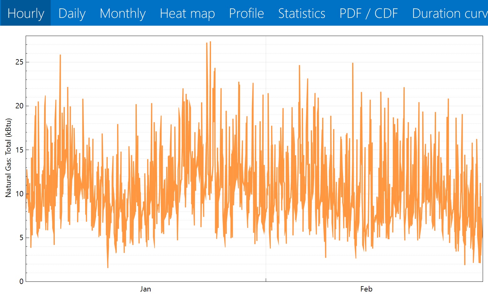
I've been using the Data Viewer "hourly," "daily," and "monthly" graphs to help me size my heating and hot water systems. I think the "hourly" data is accurate, as it gives me a result in about the ballpark I'd expect for a home of that size. It's measured in total kBTU, and since the graph is in intervals of 1 hour that means it's actually total kBTU per hour.
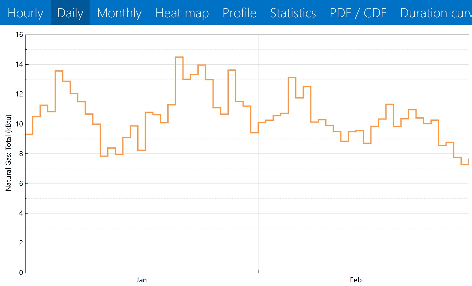
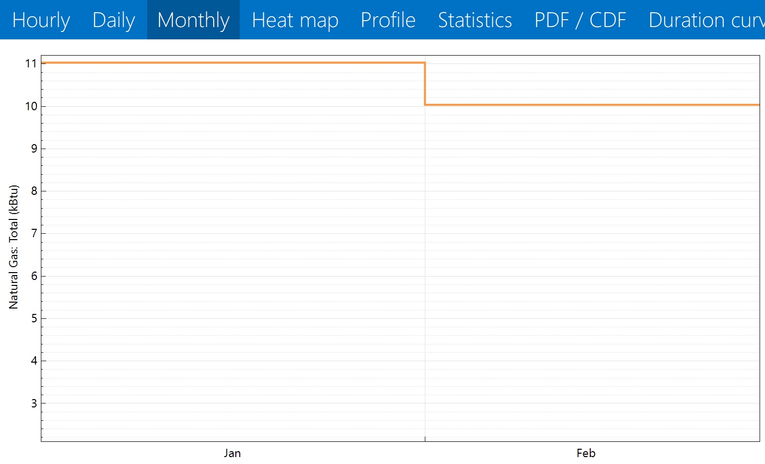
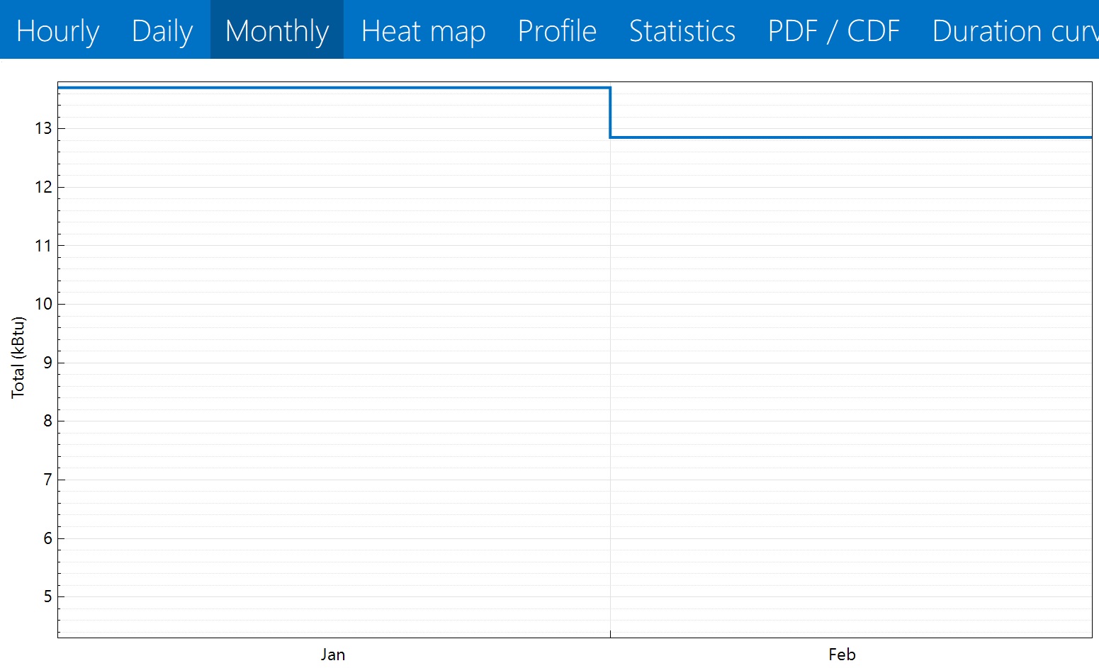
The issue is with the daily and monthly graphs: It also claims that the units are total kBTU, in this case per day or per month. However those numbers appear to actually be average hourly kBTU per day or per month--because how else would the coldest day of the year give me about 27 kBTU/hr of peak use but only 14.5 kBTU of use in total?
I guess I just want to see if I'm missing something, or if this is, indeed a known misstatement. And if so, if I'm right in thinking that those graphs should be reading Average kBTU/hr.
The graphs...I was going to upload, but cannot because I am too new. Sorry.


