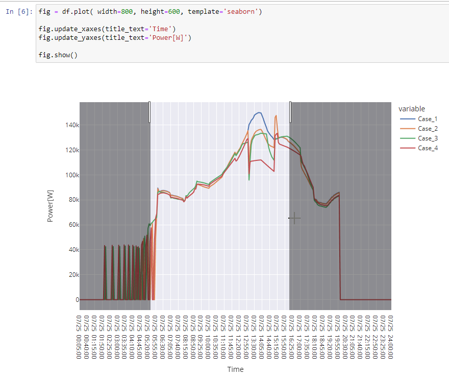
The results in eplusout.csv are helpful in understanding if and how the changes in schedules or controls are affecting the plant performance and check the results at each time-step. I have been using following options to visualize the data from eplusout.csv
- Excel plots - This is good for quick checks but not an ideal as the number of data points and plots in the workbook go up
- Plotly/seaborn in Jupyter - This needs some scripting but good for pan, zoom in to the time-series data.

I was curious if there is any other better ways to achieve the same? E.g. drop multiple eplusout.csv for comparison in a tools and select variable to plot; pan, zoom in each plot etc.


