How can i make graph from jEPlus?
Hello,
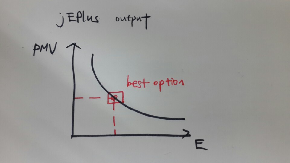
I'm trying to see the results like the picture I attached(maybe to find the best option)
Acutally, I trying to make calibrationa and optimization.
Calibration through jEPlus and optimization throgh GenOpt.
How can I make a graph like below picture?

How can i make a graph from lots of data??
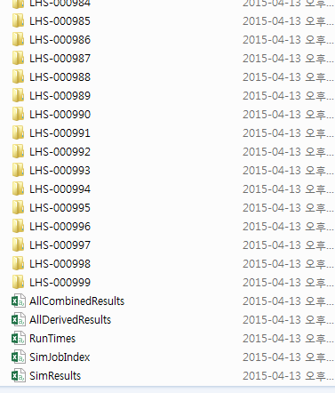
Am I have to choose AllCombinedResults??

I did LHS(Latin hypercube sampling) 1000 times!PMV is just an example!!
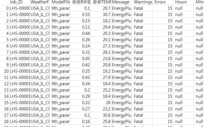
My parameter is
infiltration rate [0.1: 0.01: 0.6]
setpoint temperature [18: 0.1:32]
How can i make a graph from lots of data??
I did LHS(Latin hypercube sampling) 1000 times!
Am I have to choose AllCombinedResults??


