Is there an efficient and interactive way to visualize and analyze EnergyPlus results?
I have been thinking about this question for a while, and here is one solution I identified so far: Using Tableau to read the SQLite database generated from EnergyPlus simulation.
The work-in-progress workflow is documented in this link.
You are welcome to try it out, and your suggestions are also welcome.
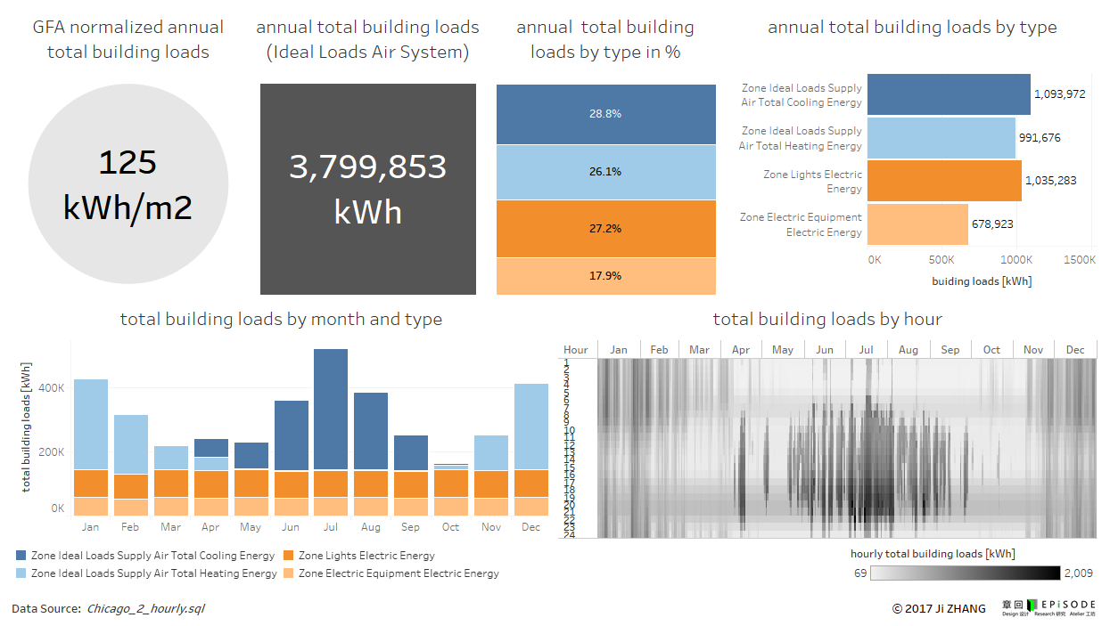
Here is the image of one of the example dashboards as provided in this workflow: