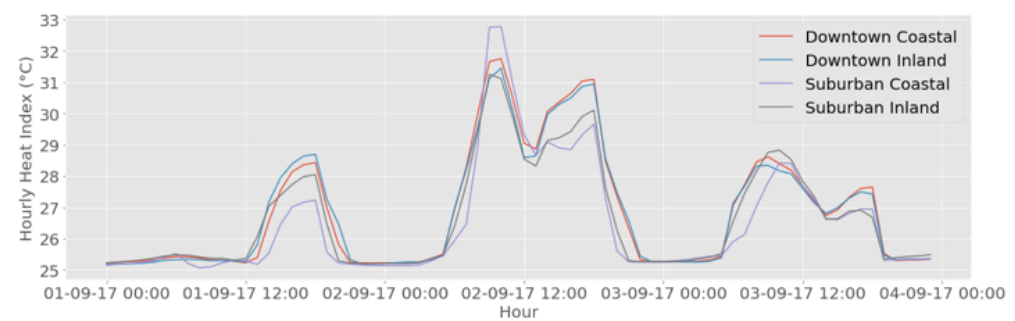
I would like to have a graphical presentation of the heat index during heat waves in a building in the tropics. Something similar to this:

This image is from this study by Luo et al. (Figure 7, if my uploaded image isn't working)
How do I achieve a similar graph to this? I am using OpenStudio and can generate the Heat Index using the Annual Thermal Resilience Summary, however it only shows number of hours and I can only graph this with a bar chart.