Hours of Safety Report Period


I would like to define the hours of safety for a building in the tropics. I see it is available through the Annual Thermal Resilience Summary and would like to understand how best to visualize this data? I can really only think of pie charts or bar graphs for this, and I would prefer it to be more specific.
In my case, I will be simulating the building through a heatwave (3+ days). I have read that I can change the Run Period in Openstudio, but would this mean I will only get the results, for example, 1 week of May? It would be ideal for me to still see a graph with the average conditions for the whole year and then see a spike during the duration of the heatwave.
Like this (from NOAA):
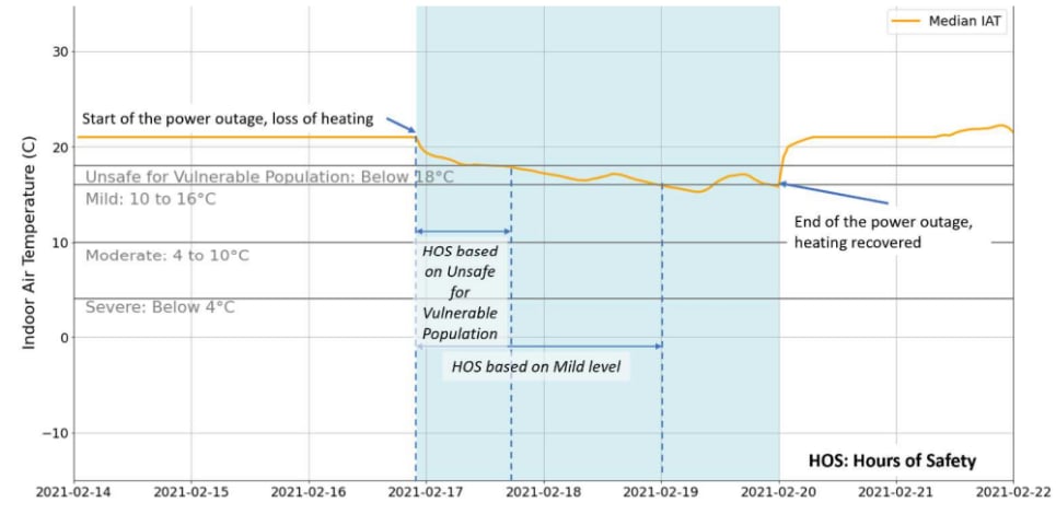
I believe I can emulate the graph above by plotting indoor air temperature and time, but how would I be able to show the hours of safety values (Hours of Safety [hr] and Safe Temperature Exceedance Hours [hr]) in this graph?
I have also read about HOS and looked into Output:Table:ReportPeriod, but I can't seem to find this object in OS. How would I be able to modify the Hot Stress Temperature Threshold? It is default at 30C and heat waves in my country can go up to 34-40C.